
Giving an EduTech Corporate Website the Ultimate Upgrade
InterGreat Education Group | Website | 2019

InterGreat Education Group | Website | 2019
Providing clear brand image and information is critical for corporate websites but with InterGreat's external-facing website, this wasn't apparent. Tackling the question of how to strengthen brand trust and improve the understanding of the brand for website visitors, I led the website redesign for InterGreat.
My Role:
User Research, UX Strategy, UX Design, Functional Specs
Team:
Danny Ng. (Product Manager)
Son Ng. (UI Designer)
Quyen T., Thai D. (Developers)

BEFORE: the homepage was static and unscorllable

AFTER: the experience is now fluid and dynamic
Although a number of brands under InterGreat Education Group (IEG) are prominently established within the education sector, IEG as a parent company has not enjoyed the same recognition and these brands are often perceived as completely independent. This posed a challenge for communication with potential partners, clients and talents when discussing business propositions with IEG as the primary brand.
I learned about this problem from one of the Education Consultants. At a conference, she met with a potential client and learnt that it was difficulty to source for further information regarding InterGreat. When the potential client visited the website, he was suspicious of whether IEG was a real company as the website looked almost "too empty" and were "just full of stock images".
Specifically, the old website displayed little essential information about the company and its subsidiary brands. Not only did they create a negative first impression, brand trust was also greatly compromised.
As a company with a number of successful brands, InterGreat holds impressive statistics and achieved milestones. However, users could not find this information on the previous website. So for the revamp, I highlighted their achievements alongside with familiar logos/brand names to quickly establish IEG's credibility and scale, thus strengthening user confidence in the brand even at a quick glance.


Following the brand identity redesign I had previously done for InterGreat, the website needed an aesthetic overhaul to match. As the company focuses on international education and technology with a contemporary look, with the rebranding, I created a secondary colour scheme to easily compliment the original grey tones; and illustrations were introduced for a lively vibe.
In addition, I decided to include subtle interactions as these little details can sweeten the experience while not making them too loud in order to ensure they were not too distracting.


…Ok, not exactly, it's still a corporate website after all. But with the previous website lacking stories and images from real people, users questioned whether the company was even legit. So I worked with stakeholders and the content team to bring out the founder's story. We also wove in personal stories from the management team, fun pictures from each office, and teacher testimonials.
After all, users are human, and the best way to connect with them is to tell real, genuine stories that let them know that this is more than just an educational institute -- it's a community.


With a range of different services and tools, the two key aspects of InterGreat's ecosystem are offline and online education. It could be hard for users to imagine what InterGreat can offer. Therefore, I created simple case studies of a typical student journey to illustrate how IEG's ecosystem can provide each student with customised support in line with their personal study goals.

For this project, I worked with several senior managers, education consultants, and the admissions team across all the company product lines, in order to figure out the target users for the website. I defined 4 main user groups. Mainly, students, schools & institutions, stakeholders & government associations, and talents/job seekers. I then arranged early interviews with representatives of these users and conducted user testing. Through these, the pain points of the website became abundatly clear.

I did a study on IEG's direct and indirect competitors. For this project, I focused mainly on comparing information architecture and features of their websites. The research was conclusive: InterGreat's website lacked what many deemed as essential components and features compared to their competitors:
1. No section for Story and Values
2. No clear milestones and statistics
3. Job posts were linked to an external site which created an unnecessary step for users to perform their task
4. No testimonials from real people, which affected credibility
5. No information regarding key members of staff (educators etc.)
Based on my previous research on users and competitors, I invited stakeholders, UI designer, developers and representatives from Consultant and Marketing teams to create a brainstorm board where everyone could give their ideas on features, content and visual direction for the upcoming website. We discussed the ideas based on both technical and time constraints.


As one of the challenges for this project is that InterGreat has several sub-brands on both online and offline platforms. What's more, its ecosystem spans widely across both young learners and professionals. Needless to say, working out a new information architecture was an uphill challenge.
I started by gathering research from stakeholders and key users to define business requirements and user expectations. I created several sitemap iterations, each showcasing their brands unified under IEG. Then, I dived deeper into two key branches of the ecosystem: (1) offline & online; (2) K-12 all the way to post-graduate.
Using card sorting with stakeholders and team members, we decided on the new sitemap that both satisfied the businesses requirements without forsaking the user experience. From this, we developed a tight development timeline.

V1: Does not explain the ecosystem

V2: Too many sub-categories in About Us section

V3: Complicated category layers of the ecosystem

FINAL: Cover all important sections while minimising the development effort
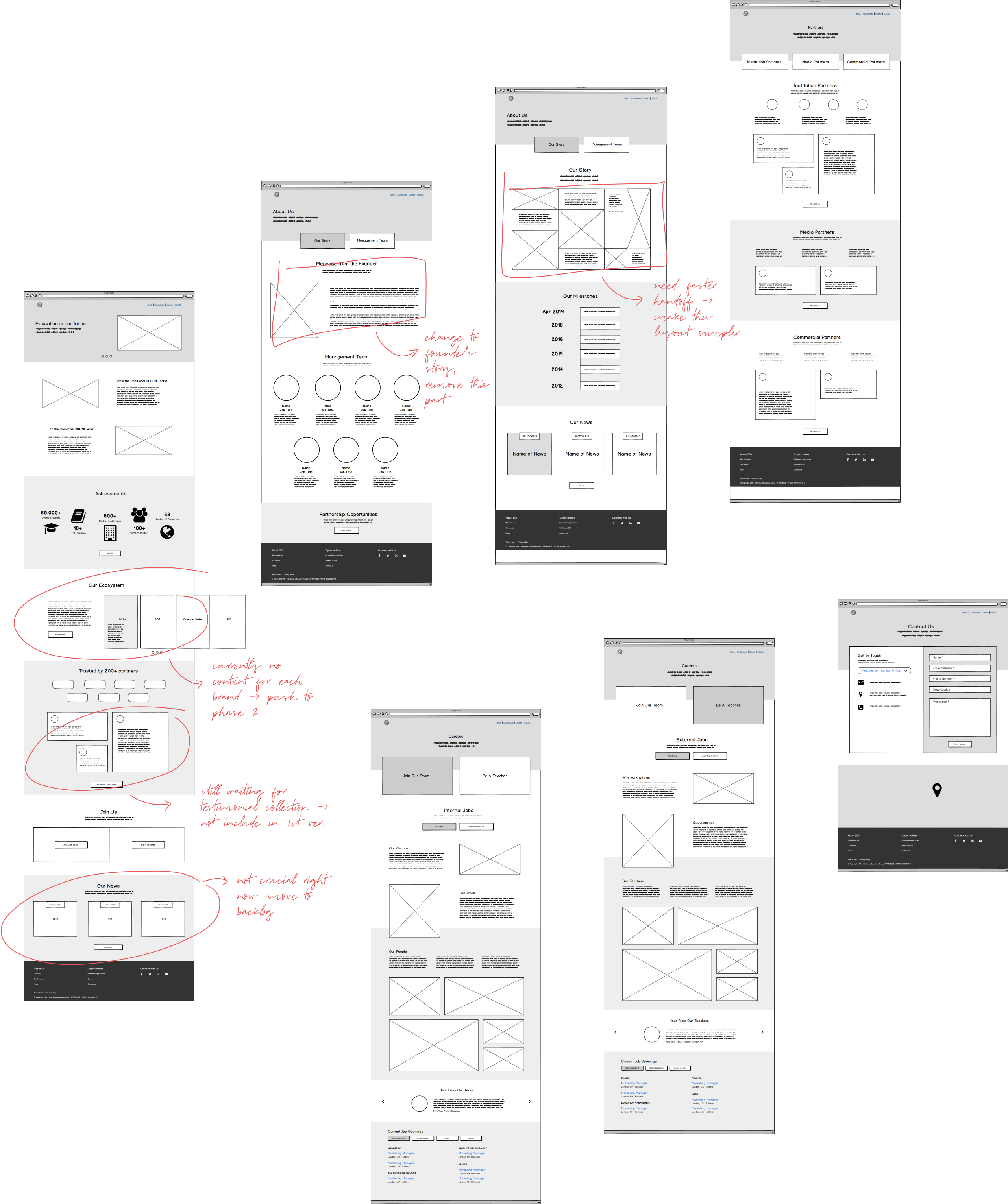
Initially, I designed the wireframe based on the chosen sitemap. As with all projects, as development continues, limitations and changes shift as well. The website's timeline grew tighter as well, and we had to churn it out for an important education expo in Shanghai. Ultimately, I had to resort to an MVP version and leaving the Final version for the next phase.
The lesson here is that good wireframing can help expedite the process, and can save a lot of trouble in a case where development timelines change.

The visual design and detailed interactions were then created by the talented UI/UX designer Son Nguyen and front-end developer Quyen Tran. As I was working with them to bring the design to life, their expertise and attention to detail truly allowed even the most minor of details coherent with the overall design.
To help the team move more efficiently, I created the functional specification document in tandem with the UI design development. This laid a solid foundation for both developers and testers as the development cycle continued.

The new website was up and ready just in time for the education expo. Alongside the identity redesign, InterGreat finally has a unified look, from printed marketing collaterals and presentation slides to the official website.
Initially, this project struck me as something rather straightforward. Nonetheless, as with every project, there are always key takeaways:
Adapting to new constraints
It's quite often that things won't be as smooth as we planned. Even with the inclusion of buffer time in the project development cycle, I couldn't foresee unexpected manpower issues to be as impactful as it was. I had to adapt to the new circumstances and reprioritize in order to deliver the best design under tight deadlines.
Be open-minded
Each member of the team is an expert in his/her own field. When it comes to trying to understand the business needs, asking stakeholders as many questions as possible is the best way for me to find out what problems the business is facing. Similarly, the designer and the developer contributed to the project in ways I couldn't have thought of. And users are experts too. Each of them has unique needs and therefore how they respond to the design can be completely different from each other.